
Scalable Game Design System for Multi-Studio Collaboration
Year
June 2024 to present
What I did
-
Built component & style library
-
Defined color, layout, interaction specs
-
Standardized multi-resolution behaviors
-
Created onboarding kit for new studios
-
Developed design QA & art review checklist
-
Audited visuals & asset quality per studio
Unifying game visuals across studios with a scalable design system
This scalable game design system is built on two core pillars: Design Language and Design Guidelines. The system includes visual specifications for key game elements such as consoles, popups, and animation behaviors. It was implemented across multiple studios, with visual outputs tested and reviewed to ensure consistency and brand alignment. To support efficient onboarding and cross-studio collaboration, a documentation structure and review checklist were established, along with a tracking sheet to manage individual studio requirements.

Brand Identity
Design Guideline
Foundation
(Color, Iconography, Typography, Layout, etc.)
UX Guidelines
(Usage, do and don’t, etc.)
Components
(Button, Modal, etc.)
Design Principle
Design Language


Design Language
We will continue to use the Microgaming logo across all markets. The Aurora concept, paired with an expanded color spectrum, now unifies all product pillars, conveying a message of rebirth and a new era for the brand.

Clarity

Consistency

Usability
Microgaming’s products are built on shared design values and principles. At the core are Clarity, Consistency, and Usability—ensuring that every experience is intuitive, cohesive, and easy to navigate across various platforms and studios.
Foundation defines the core visual elements—color, iconography, typography, game layout, and game background—that ensure a cohesive and recognizable look across all game interfaces.

 |  |  |  |  |
|---|


Design Guideline
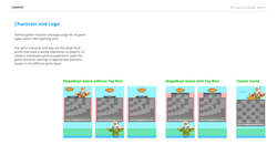
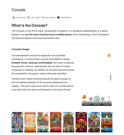
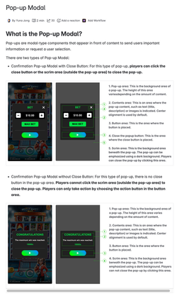
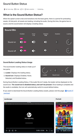
Design Components define key game interactive elements and game feature visuals—such as autoplay animation, bonus buy feature, spin/stop buttons, and game console layouts across different device resolutions. It also includes components like game intro, game history, big win effects, lobby icons, and in-game labels to ensure consistency and reusability across all titles.
 |  |  |  |  |  |
|---|---|---|---|---|---|
 |  |  |  |  |  |
 |  |  |  |  |  |
 |  |  |  |  |  |
 |  |  |  |  |  |
 |  |  |  |  |  |
 |  |  |  |  |  |
 |  |  |  |  |  |
 |  |
Game Art Review

Cross-Studio Game Art Review & Quality Assurance
Coordinate game art schedules and review checkpoints with studios across multiple countries. Responsible for reviewing all slot game art before launch—ensuring each title follows the Design System and meets visual quality and production standards across teams.
